
Design Systems for Mobile: One Codebase, One Language with Flutter
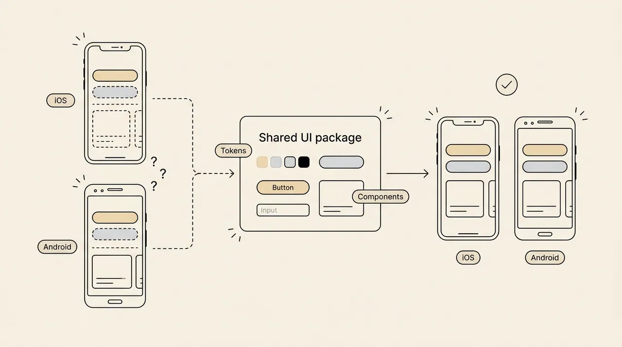
The same app, two platforms, two teams. The same button comes out with different spacing, a different shadow and a slightly different colour.
Users don’t call it “two codebases”. They call it an inconsistent brand.
The problem isn’t two platforms, it’s two realities
When iOS and Android are built separately, every component exists twice. Each team makes its own small decisions, and the gap grows with every release.
- A design change has to be made twice.
- The roadmap slows down because every feature is built twice.
- QA tests the same scenario on two different implementations.
- The two apps drift apart a little more each month.
In Flutter, the component system lives in one place
Flutter draws its own interface from a single codebase. That makes it a natural home for a design system: tokens in one theme, components in one shared package, and one change that reaches both platforms.
Consistency on mobile doesn’t come from two teams getting the same thing right twice. It comes from getting one thing right once.
How to do it: five steps
You don’t have to build everything at once. Start with steps 1 and 2 and package your five or six most used components. That is the MVP approach.
1. Gather your tokens in one theme layer
In Flutter, colour and typography already live in ThemeData (colorScheme, textTheme). For your own values, such as spacing and corner radius, use a theme extension (ThemeExtension):
- Define a class such as AppTokens that holds spacing, radius and shadow values. A theme extension needs copyWith and lerp methods; lerp is what makes light and dark theme changes animate smoothly.
- Register it in ThemeData.extensions.
- In screens, read values from the theme. Don’t write raw numbers or Color(0xFF…) values in widget code.
2. Move components into their own package
- Create a separate package in the project (for example packages/app_ui) and export all components from one file.
- Let components take semantic options only, such as “primary or secondary” and “enabled or disabled”. Don’t pass colours or sizes in directly.
- Inside each component, use theme values. No raw colours.
- To see the components live, use a catalogue tool such as Widgetbook.
3. Decide platform differences on purpose
Write down what is shared and what adapts, and decide it once as a team:
- Stays shared: colour, typography, spacing, icon set, and how buttons and inputs look.
- Adapts to the platform: back gestures and page transitions, date and time pickers, and system controls such as switches.
- Flutter’s .adaptive constructors (for example Switch.adaptive) give you this adaptation out of the box, and you can read the platform from Theme.of(context).platform.
- The rule: adapt behaviour, not the brand.
4. Make design and code speak the same names
- Match your Figma variable names to your token names one to one, so “color/action/primary” in Figma means the same thing in code.
- Keep tokens in one source, such as a JSON file, and generate both the design and the code side from it with a tool like Style Dictionary. That ends copying values by hand.
- Make design changes in the token first, then let them flow into the screens.
5. Protect consistency with tests
- Write golden tests for your components. Flutter compares a component’s rendered image with a reference, so an accidental change shows up immediately.
- Run these tests in CI.
- In code review, ask one question: “Is this screen built with components from the package?”
Conclusion
The strength of a mobile app isn’t how many screens it has. It’s how it feels as one product on every device.
One codebase and one component system mean you design once and it behaves correctly on both platforms.